Samsung
$3.4M site redesign and platform migration project
̌
PLATFORM REDESIGN
The 2015 initiative for Samsung.com was to migrate to a brand new component-based Content Management System, Adobe AEM.
I was responsible for delivering the Design System Foundation Guidelines and all the AEM Components.
Designing a Design System from scratch
When working on the launch of the brand new site there was not an established design system to build off of. I need to go back to the basics and unify the site aesthetics with the overarching Branding for the US Market. I collaborated with the Brand, Media, Marketing, B2B, and eCommerce teams to create a One Samsung approach to the new design.
RESPONSIVE GRID
GRAPHIC ELEMENTS
TYPOGRAPHY
( SAMSUNG ONE LATIN & SAMSUNG SHARP SANS )
COLOR PALETTE
COMPONENT RULES
AEM DASHBOARD
GLOBAL NAVIGATION
The most contentious element of our site
Due to Samsung’s heavily matrix organization model the Global Navigation Component was set on its own project track separate from the rest of the site build.
Each line of business wanted ownership over the content in the GNB resulting in consumer confusion.
I commissioned a Card Sorting Test and a Tree Test to develop a GNB Taxonomy that was consumer driven. And I directed a design approach that visually resonated with our Branding and modern eCommerce industry standards.
COMPONENTS
My plan was to start our focus on identifying the 1st wave, a base set of components prioritized just for launch that were also scalable for growth. We conducted an audit of our current site through the lens of a component based system to identify the number of unique components we would need and how many variations or options.
CROSS CATEGORY FAMILY template
The Cross Category Template was a new concept that solved a limitation with our previous platform hierarchy. Our new requirement challenged our dev team to restructure the content hierarchy allowing us to showcase different product categories together on one template.
CATEGORY TEMPLATE
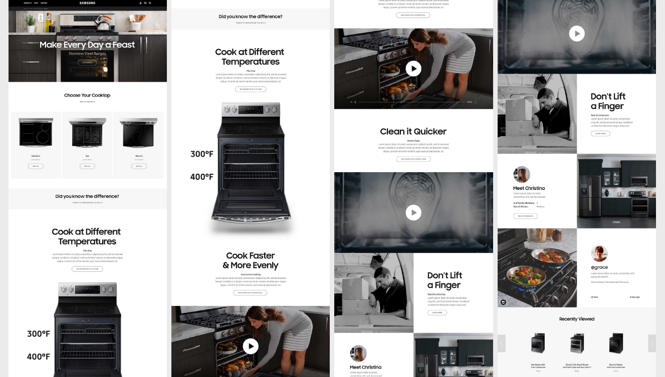
I approached the component work by starting with our core pages and taking our 2 most differentiated product families Phones & Home Appliances to validate that our components would cover every possible content requirement needed to build our pages.
RESPONSIVE mobile template
To ensure that we took the time to design mobile view right I had the team switch to a Mobile First approach. We would design in mobile first to understand how the components should stack or paginate, font scaling, and padding adjustments for all the elements. We conducted all of our stakeholder presentations with mobile and tablet views before showing desktop which resulted in productive and educational content conversations with the lines of business.
key results
1st Consumer centric driven design approach
1st Responsive site
1st in-house UX Team
Delivered 50+ components in 6 months


